Your AI claims 92% accuracy. Is that good enough?
Imagine your company runs breast-cancer screening, and you have built an AI that reads each mammogram and flags who might have cancer. It claims 92% accuracy. Before you rely on it, you have to judge it yourself. And to judge any AI, you first need to know how it can go wrong.
Map each image to a risk score
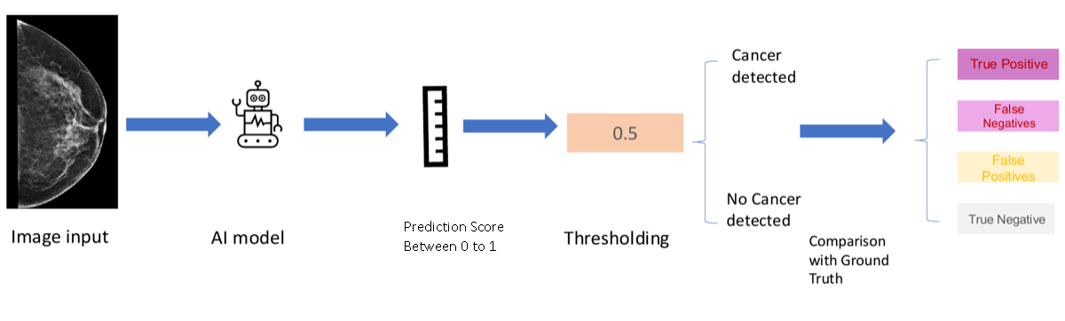
To understand the mistakes AI models make, we first need to understand how AI works. The nature of AI is to predict a risk score based on the raw input data. Using forward propagation, as we learned previously, the model reads each mammogram and returns one number between 0 and 1. The higher the score, the more the image looks like cancer.
Now we have 10 images: 6 are from patients without cancer, and 4 are from patients with cancer. The AI processes all 10, and each image gets a score, as shown above. Ideally, the cancer patients would score high and the healthy ones low.
The colors show the truth for teaching; in real screening you see only the scores.
Draw a line: set the threshold
Look at the two groups above. Generally, patients with no cancer receive lower risk scores and patients with cancer receive higher ones. But not always: one patient without cancer scored high, and one cancer patient scored low. The two groups overlap, and that overlap is what makes things tricky.
So we now draw a line called the threshold. Patients with risk above the threshold are classified as cancer; patients below it are classified as clear. There is no single right place for the line, and moving it changes which patients are flagged as cancer.
The two types of mistakes
Remember the question we opened with: how many types of mistakes can the AI make? You answered two. Back then it was just a number; now that you have drawn a threshold, the two mistakes finally show up, right there in the picture above.
False Positive, the false alarm: a patient has no cancer, but the score lands above
the threshold, so the AI wrongly calls this patient cancer.
False Negative, the missed cancer: a patient has cancer, but the score lands below
the threshold, so the AI wrongly calls this patient clear.
Now do you see the two types of mistakes?
The confusion matrix
Now count what the threshold did. At a threshold of 0.5, 4 patients without cancer are correctly called clear, 2 are false alarms, 3 cancers are caught, and 1 is missed. Arrange those four counts in a two-by-two table and you have the confusion matrix: the figure on the left converts to the matrix on the right. The confusion matrix is what people use to evaluate a model's performance: one threshold, four numbers that account for every patient.
The two errors have names: Type 1 and Type 2
This is the same matrix you just built, and the two mistakes in it have formal names. A False Positive is a Type 1 error: the false alarm. A False Negative is a Type 2 error: the missed cancer.
A change in the threshold affects both Type 1 and Type 2 errors. Set it high and the AI flags fewer patients, so Type 1 errors fall, but more cancers slip through and Type 2 errors rise. Set it low and the reverse happens. You cannot push both to zero at once, and in screening the Type 2 miss is the mistake that can cost a life.
Every threshold gives a different confusion matrix
The confusion matrix depends on the threshold. Watch below: as the threshold slides from 1 down to 0, the four counts keep changing. No single threshold tells the whole story, so to judge the model itself we need to look across all thresholds at once. Press Pause anytime to freeze the sweep and study a moment.
The ROC curve and the area under it (AUC)
Here is where the ROC curve comes from. The confusion matrix depends on the threshold, so to capture the model's full performance across different thresholds, we take the sweep you just watched and, at every threshold, record two rates: the True Positive Rate, the share of cancers caught, and the False Positive Rate, the share of healthy patients wrongly flagged. Each threshold becomes one point, and together the points trace the ROC curve. Watch it happen above: as the threshold sweeps across the scores, the curve draws itself.
That was one model. Now suppose a second model comes along, as below. Model B is better: it gives the cancer cases high scores and the non-cancer cases low scores, which reduces both Type 1 and Type 2 errors. But every threshold gives different numbers, so how do we compare two models fairly? We compare their whole curves.
Draw the ROC curve for each model and lay them on the same axes: the curve that pushes toward the top left corner belongs to the better model. A strong model catches the cancers first, so its curve climbs straight up before turning right; a random model mixes the two groups, so its curve just follows the diagonal. The area under the curve, the AUC, turns each curve into one number: 0.5 is a coin flip and 1.0 is perfect. Real mammography AI models score roughly 0.61 to 0.70.
A stronger model bows further toward the top left, and its AUC is higher.
So the order is: first pick the model by comparing ROC curves and AUC, then set that model's threshold based on which mistake is costlier. Choosing the model and choosing the threshold are two separate decisions.
You're ready for the hands-on exercise
Everything you just walked through — risk scores, the threshold, the confusion matrix, and the ROC curve — is live on one screen behind this walkthrough. The “About this exercise” panel at the top of that page explains the goal and what each control does, so you can start exploring right away.
Reopen this walkthrough anytime with “How to use this page” in the top bar.